Water polo diagram
The water polo diagram is a type of conventional chart. It supports the custom SVG graphic display and applies to the display of single data. The series of texts or pictures can be customized to achieve special effects. This document introduces the meaning of each configuration item of the basic water polo diagram, to help you use the water polo diagram component quickly and accurately.
Configuration
Basic settings
width: component width in the editor
height: component height in the editor
top: distance between the component and the top of editor
left: distance between the component and the left side of editor
Global
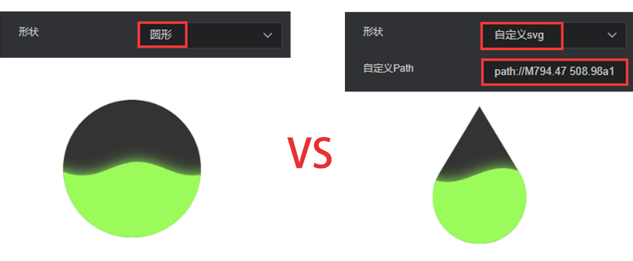
Shape: display graphic of the water polo diagram, supporting custom SVG codes.
Custom path: if the “custom svg” shape is selected, the custom svg path can be entered here.
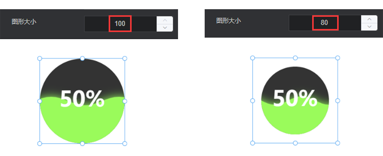
- Graphic size: graphic size in the designated area
Outline
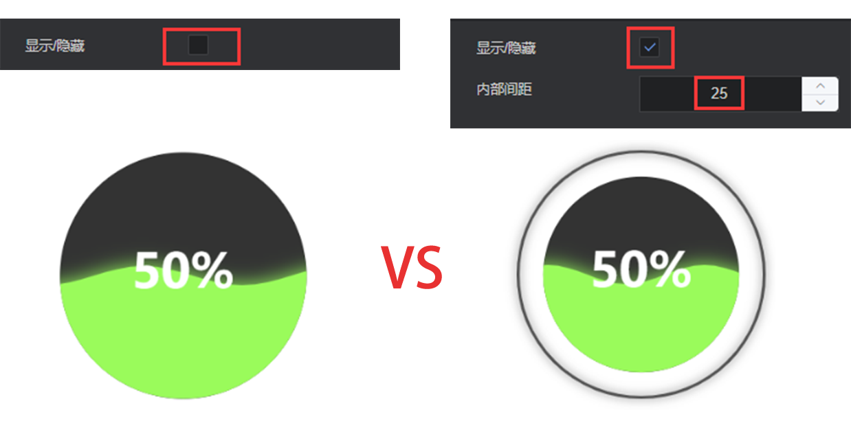
Show/Hide: show/hide the outline of the water polo diagram.
Padding: spacing between the displayed outline and water bubble diagram
Outline style
Width: width of the outline
Color: color of the outline, supporting color values in hex, rgb and rgba formats
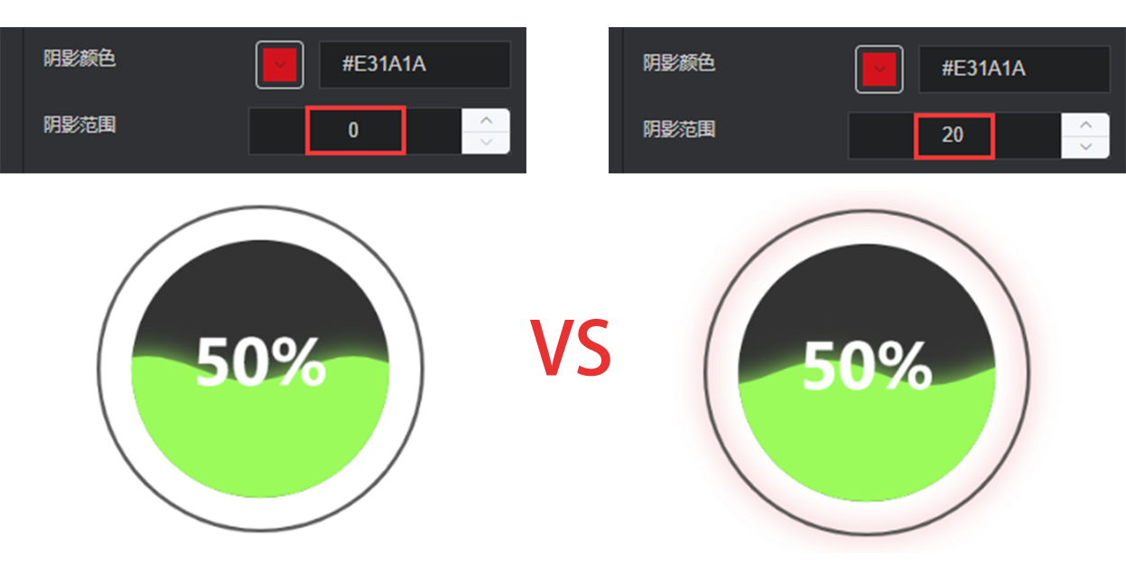
Shadow color: shadow color of the outline, supporting color values in hex, rgb and rgba formats
Shadow range: shadow range of the outline
Transparency: transparency of the outline
Wave
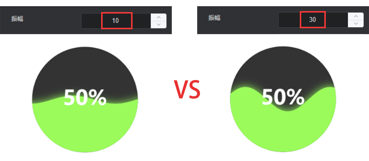
- Amplitude: vibration amplitude of the wave. The greater the value, the larger the wave is.
Rippling direction: select the direction of the rippling wave. Options: from left and right, and from right to left.
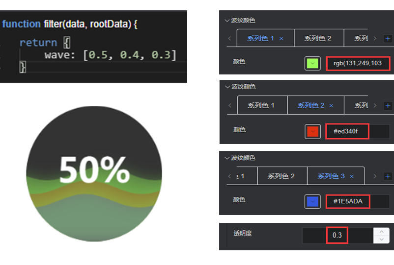
Wave color: control the wave color in conjunction with the wave field of the data item
return {
    wave: [0.5]
}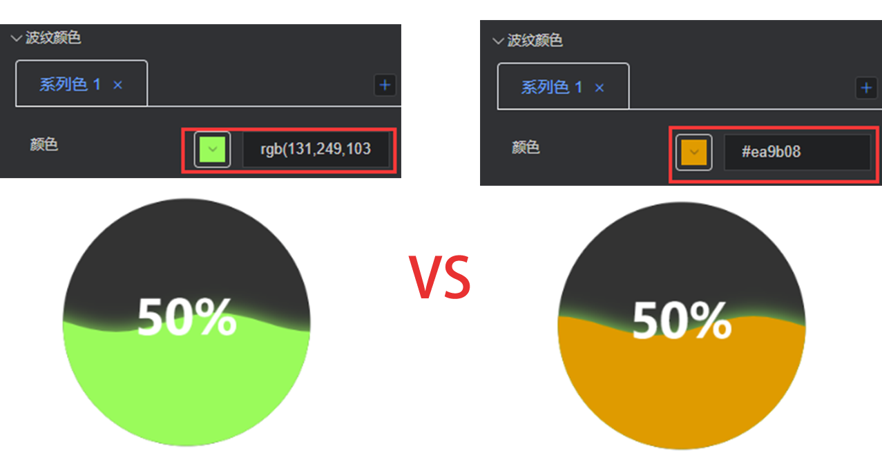
Style
Shadow color: shadow color of the wave
Shadow range: shadow range of the wave
Transparency: transparency of the wave
Animation
Enable: enable the wave rolling animation
Animation duration: control the wave rolling speed. The shorter the time, the higher the wave rolling frequency is.
Background
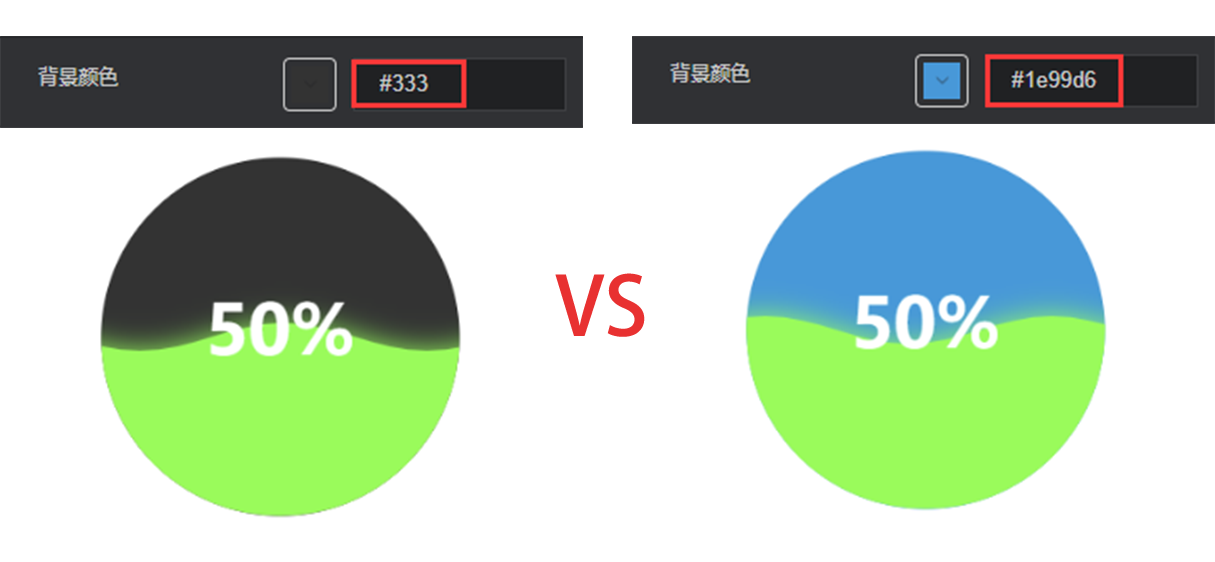
- Background color: set whether to show the legend of this chart
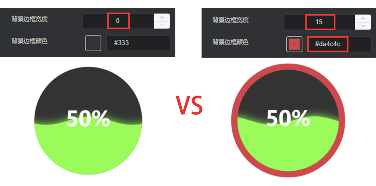
Border width: border width of the graphic
Border color: border color of the graphic
Custom element
This configuration item is an array, for which multiple custom elements can be configured. The custom element may be the plain text or picture.
Type: type of the custom element. Options: text and picture.
Location
Control type: location control type. Options: system control and manual control.
System control
Horizontal position: left, center and right
Vertical position: top, center and bottom
Manual control
Left margin: left margin of the custom element
Top margin: top margin of the custom element
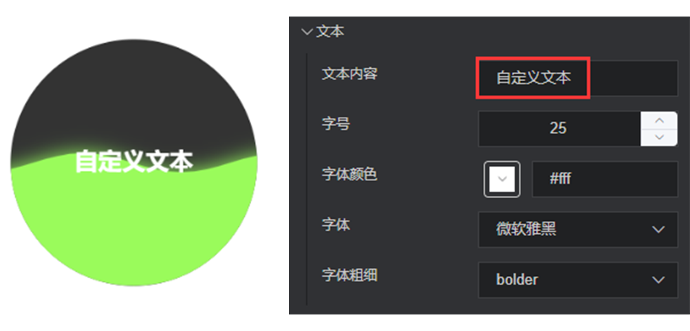
Text
Text content: the content to be displayed in text
Font size: font size of the text
Color: color of the text, supporting color values in hex, rgb and rgba formats
Font: font of the text
Font weight: font weight of the text
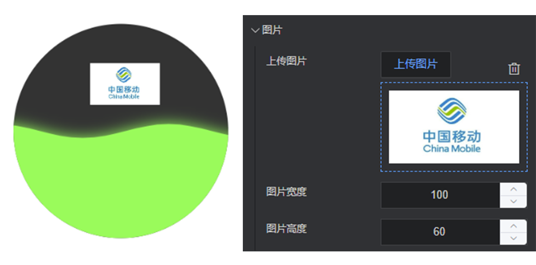
Picture
Upload picture: upload the local picture
Picture width: set the width of picture
Picture height: set the height of picture
Data
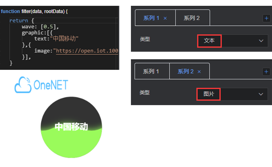
return [{
    graphic:[{
        text:"xxx"
    },{
        image:"https://xxx.png"
    }],
    wave:[0.5]
}]
If the custom element is configured for the configuration item and data item, priority should be given to the configuration of data item.
- wave: data value of the wave. Multiple waves can be configured (0-1).
graphic: set of custom elements
text: custom text content
image: online link address of the custom picture