Wireframe
Custom wireframes are supported. It is also allowed to add custom wireframes to the large screen or one module therein, to make the large display screen more attractive. This document introduces the meaning of each configuration item of the wireframe, to help you use the wireframe component quickly and accurately.
Configuration
Basic settings
width: component width in the editor
height: component height in the editor
top: distance between the component and the top of editor
left: distance between the component and the left side of editor
Title name: name of the title. The title name will be read here in case of no configuration data source.
Color: color of the wireframe, supporting color values in hex, rgb and rgba formats
Line width: width of the border, in px
Type: type of the border. Options: solid and dotted line.
Transparency: Control the wireframe transparency
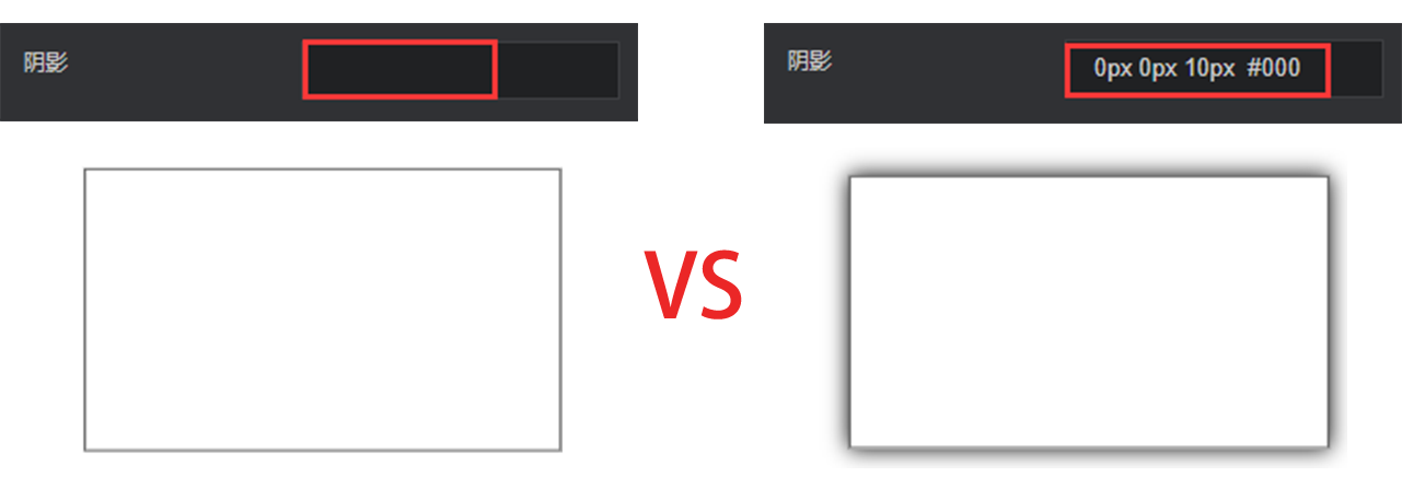
Shadow: the same as the box-shadow of CSS. The border shadow can be drawn.
Left border: display the left border after this is checked
Right border: display the right border after this is checked
Top border: display the top border after this is checked
Bottom border: display the bottom border after this is checked
Data
Data item configuration is not required for this component.