Basic histogram
The basic histogram is a type of histogram, supporting the configuration of custom y-axis intervals and multiple series of data, to display multi-dimensional data differences more intelligently. However, it occupies a lot of space on the large screen. This document introduces the meaning of each configuration item of the basic histogram, to help you use the basic histogram component quickly and accurately.
Configuration
Basic setting
width: component width in the editor
height: component height in the editor
top: distance between the component and the top of editor
left: distance between the component and the left side of editor
Global
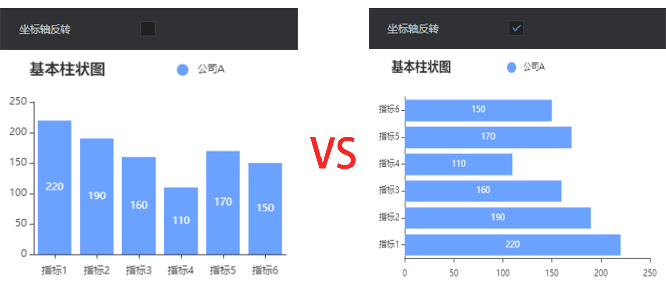
- Coordinate axis reversal: change a vertical histogram into horizontal one if this option is checked
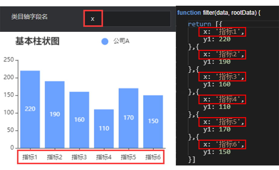
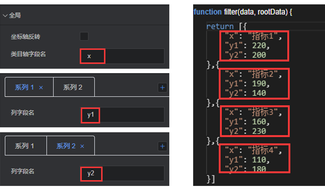
- Category axis field name: The category axis is the unique identification of each group of data, which needs to be consistent with the category field of the data item.
Background bar
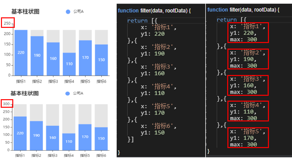
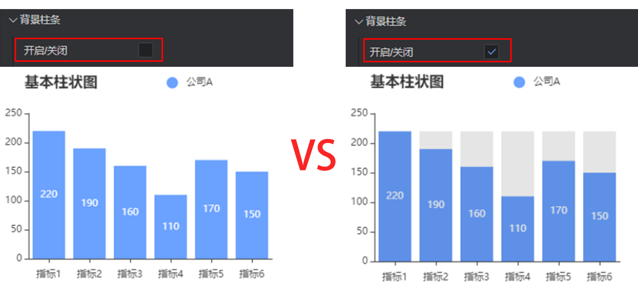
- Enable/Disable: After the background bar is enabled, a background shadow will be generated with the maximum value of the coordinate axis
Color: color of the background bar, supporting color values in hex, rgb and rgba formats
Border color: color of the border, supporting color values in hex, rgb and rgba formats
Border width: width of the border, in px
Transparency: Control the transparency of the background shadow. It can also be controlled by the color value in the rgba format.
Canvas margin
Top margin: distance between the chart and the top of component border, in px
Right margin: distance between the chart and the right side of component boundary, in px
Bottom margin: distance between the chart and the bottom of component border, in px
Left margin: distance between the chart and the left side of component border, in px
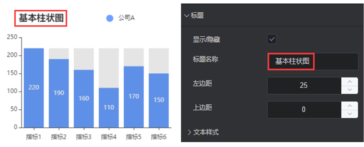
Title
Show/Hide: show/hide the chart title
Title name: name of the chart title
Left margin: distance between the title and the left side of container
Top margin: distance between the title and the upper side of container
Text style
Font size: font size of the title
Color: the color of the title, supporting color values in hex, rgb and rgba formats
Font: font of the title
Font weight: font weight of the title
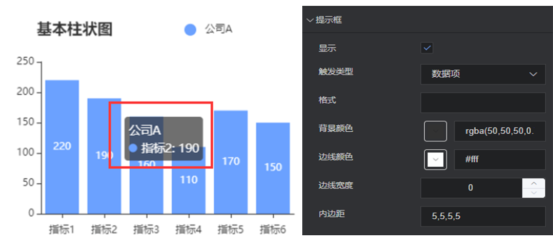
Prompt box
Show/Hide: show/hide the prompt when the cursor hovers on a point of the chart
Trigger type: show how to trigger a prompt box
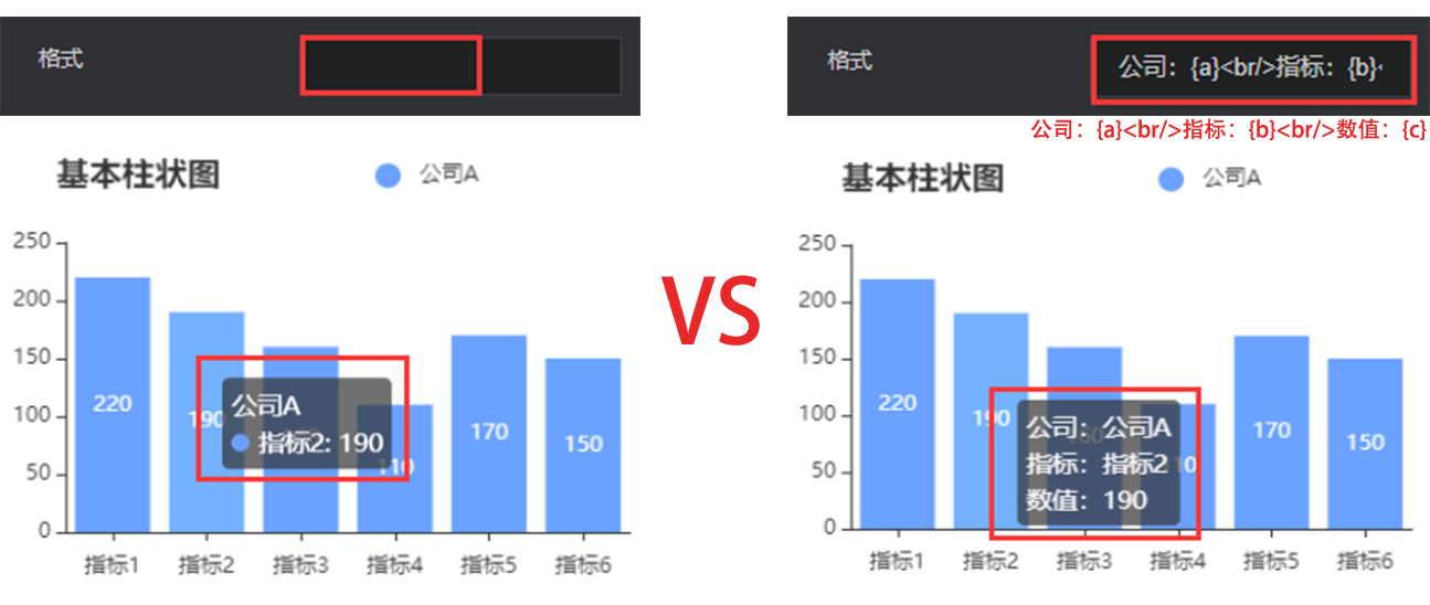
Format: The display content of the prompt box can be customized, where {a} represents the series name, {b} represents the value of the category axis, {c} represents the specific value.
Background color: background color of the prompt box, supporting color values in hex, rgb and rgba formats
Border color: border color of the prompt box, supporting color values in hex, rgb and rgba formats
Border width: border width of the prompt box, in px
Padding: padding of the prompt box. For example, “5,5,5,5” means that the top, right, bottom and left margins are 5px, 5px, 5px, 5px, respectively.
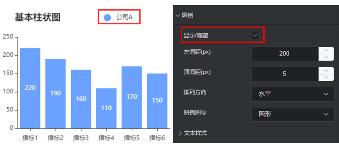
Legend
Show/Hide: show/hide the chart legend
Left margin: distance between the legend and left side of container
Top margin: distance between the legend and the upper side of container
Orientation: orientation of the legend, horizontal or vertical
Legend icon: icon of the legend, i.e. circle, square, triangle or diamond
Text style
Font size: font size of the legend
Color: color of the legend, supporting color values in hex, rgb and rgba formats
Font: font of the legend
Font weight: font weight of the legend
X axis
Show/Hide: show/hide the x axis of chart
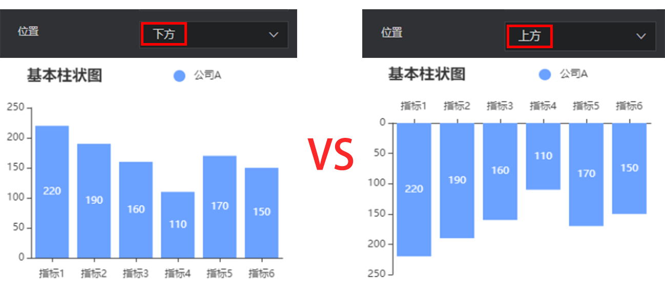
Position: change the position of x axis. Options: up and down.
Axis name
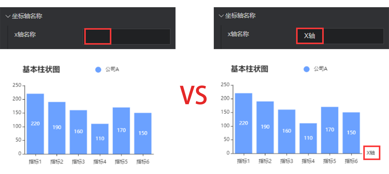
x axis name: the name of x axis
x axis name position: position of the x axis name. Options: start point, center, and end point.
Axis margin: distance between the x axis name and axis
Style
Color: color of the coordinate axis name, supporting color values in hex, rgb and rgba formats
Font size: font size of the axis name
Font weight: font weight of the axis name
Font: font of the axis name
Axis
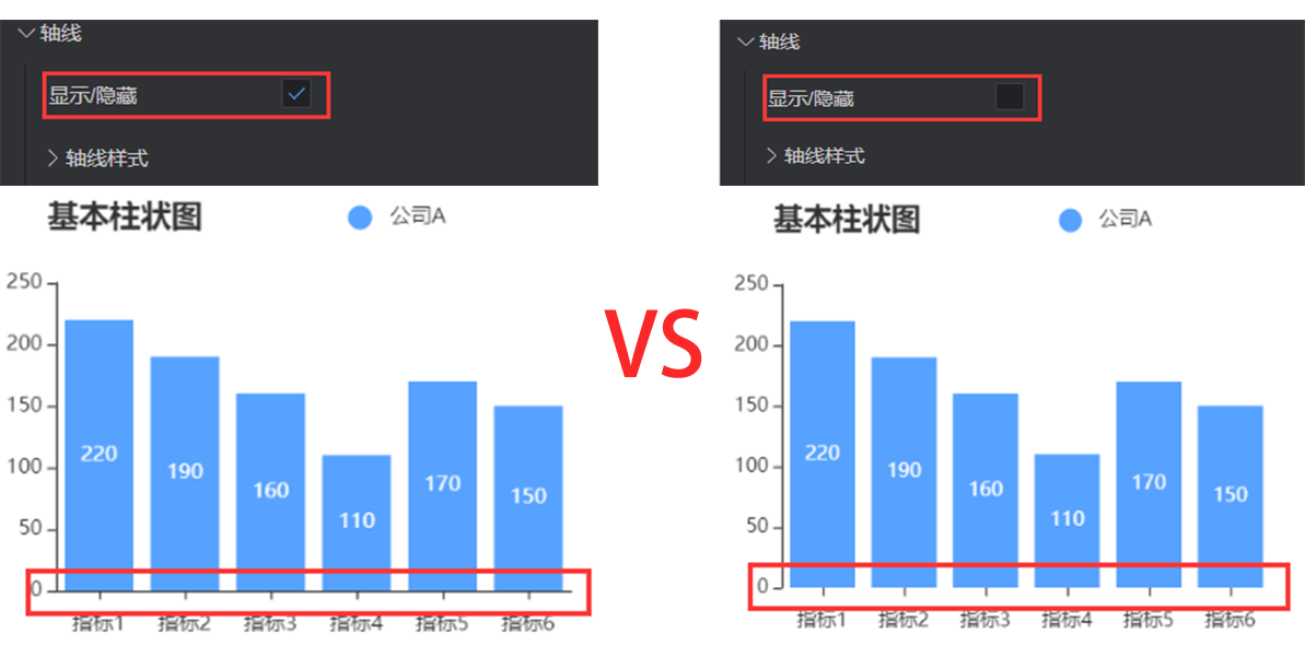
Show/Hide: show/hide the x axis
Axis style
Color: color of the axis, supporting color values in hex, rgb and rgba formats
Style: solid line or dotted axis
Width: control the axis thickness, in px
Scale value
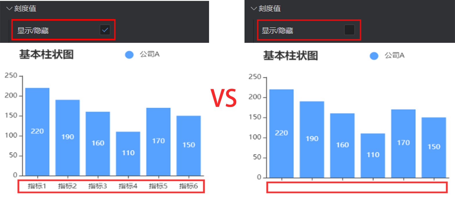
Show/Hide: show/hide the scale value of x axis
Font size: font size of the scale value
Color: color of the scale value, supporting color values in hex, rgb and rgba formats
Font: font of the scale value
Font weight: font weight of the scale value
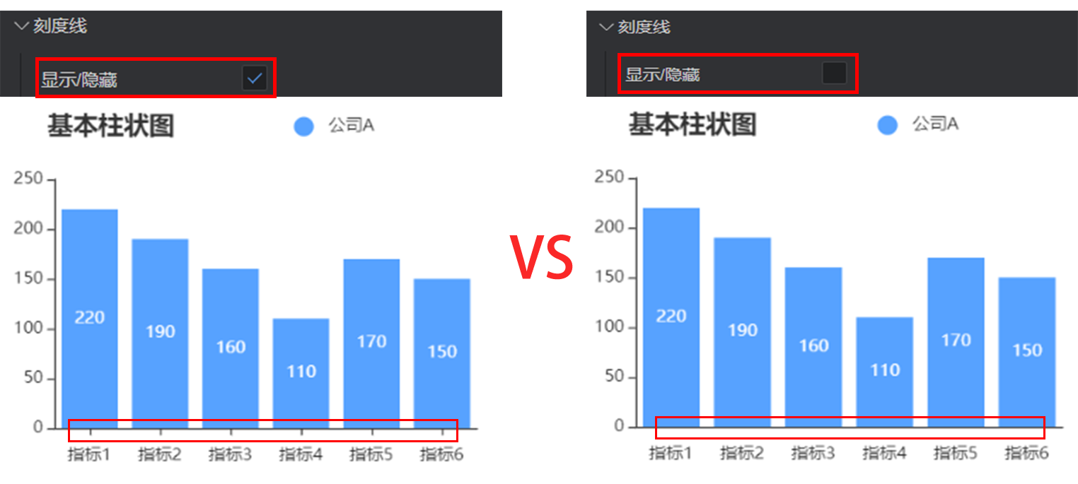
Scale mark
Show/Hide: show/hide the scale mark of x axis
Inward orientation: control the orientation of scale mark
Tag alignment: align the axis scale and tag
Scale mark style
Color: color of the scale mark, supporting color values in hex, rgb and rgba formats
Line width: line width of the scale mark, in px
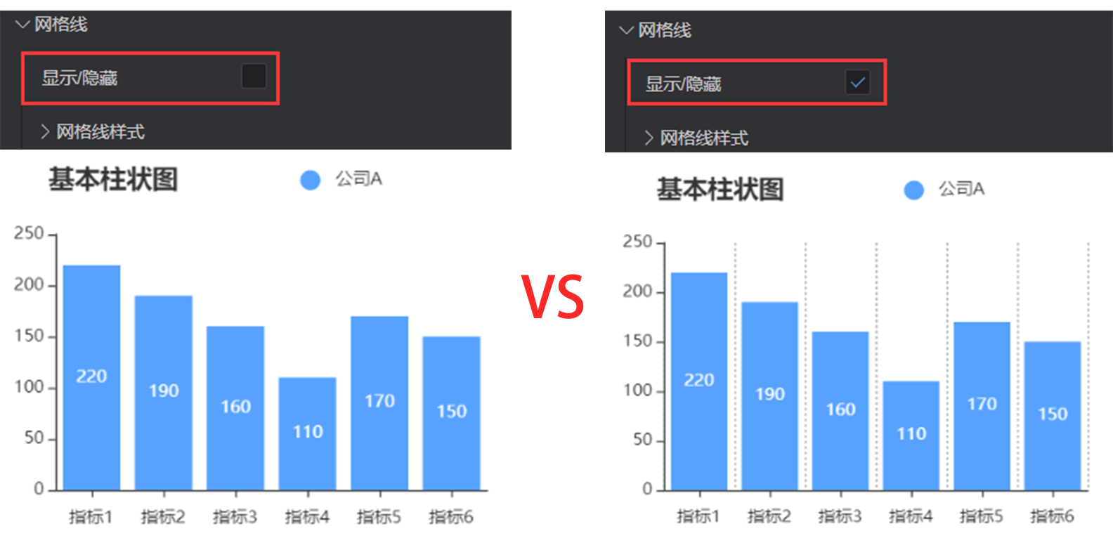
Grid line
Show/Hide: show/hide grid lines in the chart area
Grid line style
Color: color of the grid line, supporting color values in hex, rgb and rgba formats
Style: style of the grid line. Options: solid lines, dotted lines, and dots.
Line width: width of the grid line, in px
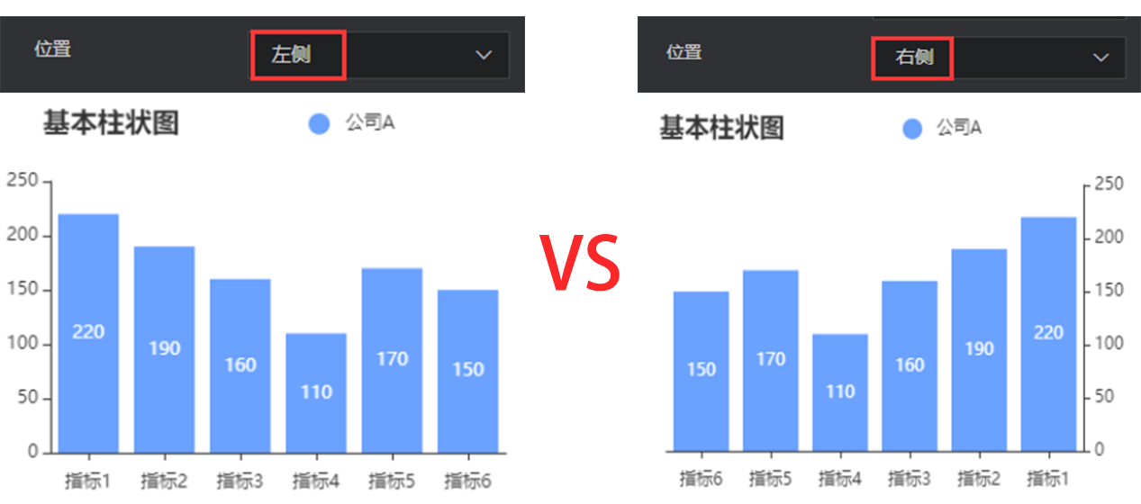
Y axis
The configuration of y axis is essentially the same as that of x axis. Refer to x axis configuration.
Show/Hide: show/hide the y axis of chart
Position: change the position of y axis. Options: left and right.
Axis name
Y axis name:the name of y axis
y axis name position: position of the y axis name. Options: start point, center, and end point.
Axis margin: distance between the y axis name and axis
Style
Color: color of the coordinate axis name, supporting color values in hex, rgb and rgba formats
Font size: font size of the axis name
Font weight: font weight of the axis name
Font: font of the axis name
Axis
Show/Hide: show/hide the y axis
Axis style
Color: color of the axis, supporting color values in hex, rgb and rgba formats
Style: solid line or dotted axis
Width: control the axis thickness, in px
Scale value
Show/Hide: show/hide the y axis
Font size: font size of the scale value
Color: color of the scale value, supporting color values in hex, rgb and rgba formats
Font: font of the scale value
Font weight: font weight of the scale value
Scale mark
Show/Hide: show/hide the scale mark of x axis
Inward orientation: control the orientation of scale mark
Tag alignment: align the axis scale and tag
Scale mark style
Color: color of the scale mark, supporting color values in hex, rgb and rgba formats
Line width: line width of the scale mark, in px
Grid line
Show/Hide: show/hide grid lines in the chart area (divided by the x-axis scale)
Grid line style
Color: color of the grid line, supporting color values in hex, rgb and rgba formats
Style: style of the grid line. Options: solid lines, dotted lines, and dots.
Line width: width of the grid line, in px
Data axis zoom
- Enable/Disable: After the data axis zoom is enabled, the displayed data items can be controlled freely. This is usually suitable for dense data items.
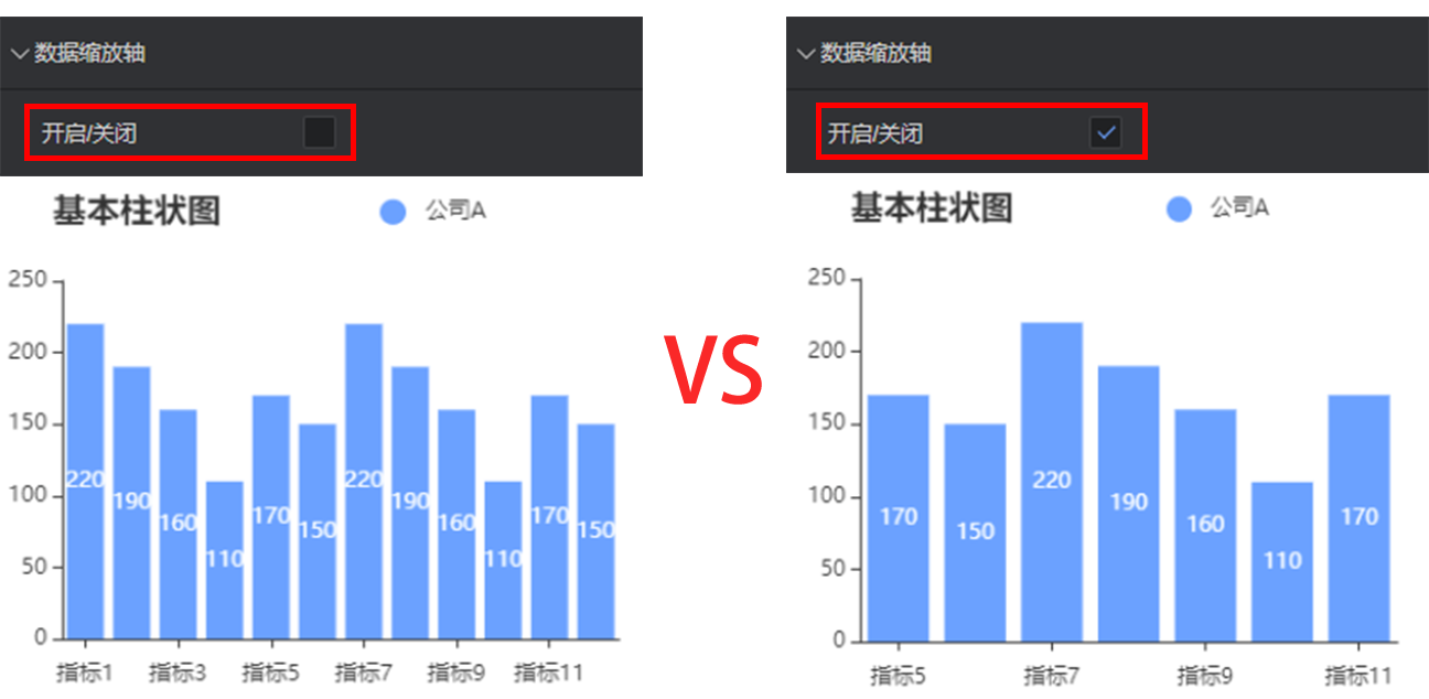
Zoom type: scroll zoom and manual zoom
Zoom type: zoom data items by mouse scrolling and switch the displayed data items by clicking them
Manual zoom: provide a zoom axis at the bottom of the component for zoom control
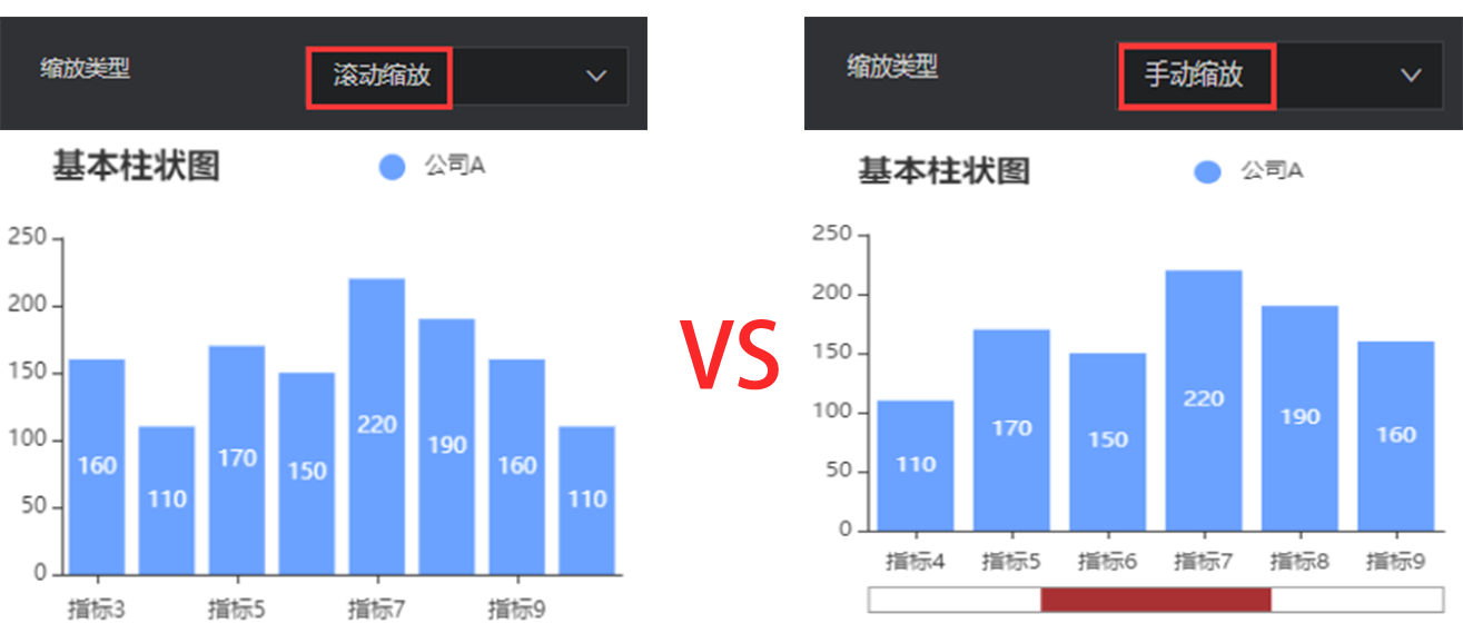
Manual zoom: provide a zoom axis at the bottom of the component for zoom control
Show/Hide: show/hide the zoom axis. It is recommended not to hide the zoom axis. If the zoom axis is hidden, the switching of data items cannot be controlled.
Height: height of the zoom axis
Bottom margin: distance between the zoom axis and bottom, in px
Start position: start position of the data range, in percentage
End position: end position of the data range, in percentage
Background color: background color of the zoom axis, supporting color values in hex, rgb and rgba formats
Border color: border color of the zoom axis, supporting color values in hex, rgb and rgba formats
Slider fill color: color of the slider in the middle of zoom axis, supporting color values in hex, rgb and rgba formats
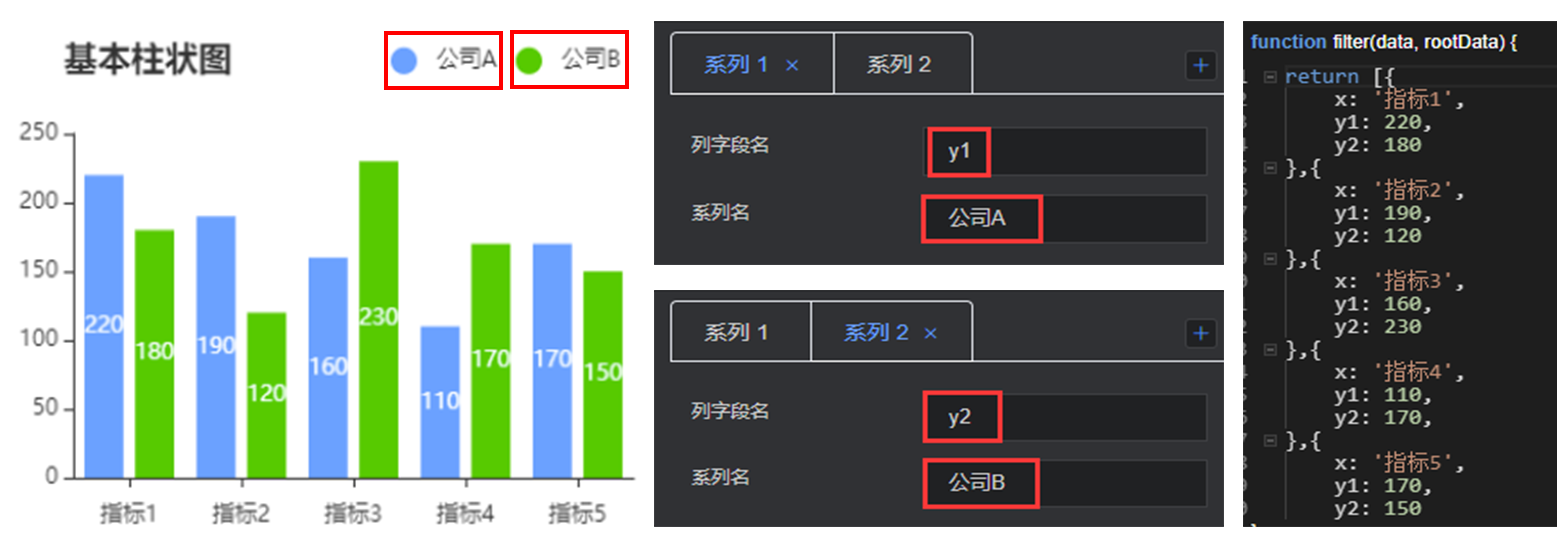
Data series
This configuration item is an array, for which multiple series can be configured. The editor will traverse data, so that the data can be rendered by one or more series configuration cycles. If some data needs to be customized to a specific style, you need to manually sort the data.
Column field name: consistent with the field in data configuration, controlling the display of one group of data in the chart
Series name: customize the legend name by changing the series name
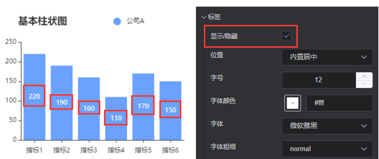
Tag
Show/Hide: show/hide the chart tag in this series
Position: control the tag display position. Options: external top, internal center, and internal top.
Font size: font size of the tag
Color: color of the tag, supporting color values in hex, rgb and rgba formats
Font: font of the tag
Font weight: font weight of the tag
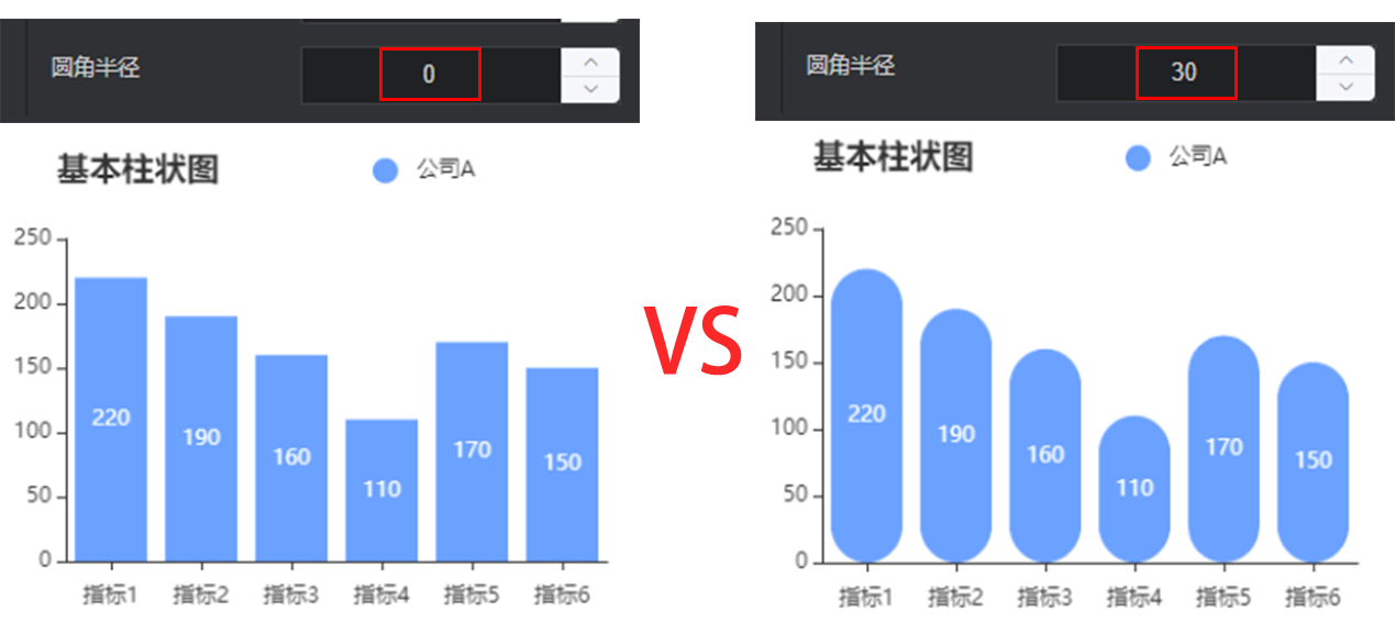
Bar style
Bar color: color of the bar, supporting color values in hex, rgb and rgba formats
Bar border color: border color of the bar, supporting color values in hex, rgb and rgba formats
Bar border line width: line width of the bar border, in px
Fillet radius: replace four corners with arcs. The greater the value, the more obvious the arc.
data
return [{
    x: 'Indicator 1',
    y1: 220,
    max: 300
}, ......]
x: custom field of the category axis, consistent with the category axis field name in global configuration
y: custom field of the data axis, consistent with the column field name in each sequence configuration
- max: maximum value of the background bar. The maximum value is set by default. You can customize it.