Area chart
The area chart is a type of line chart, which is evolved from the basic line chart. The configurable items and operation mode are the same as those of the basic line chart. This document introduces the meaning of each configuration item of the basic area chart, to help you use the basic area chart component quickly and accurately.
Configuration
Basic settings
width: component width in the editor
height: component height in the editor
top: distance between the component and the top of editor
left: distance between the component and the left side of editor
Canvas margin
Top margin: distance between the chart and the top of component border, in px
Right margin: distance between the chart and the right side of component boundary, in px
Bottom margin: distance between the chart and the bottom of component border, in px
Left margin: distance between the chart and the left side of component border, in px
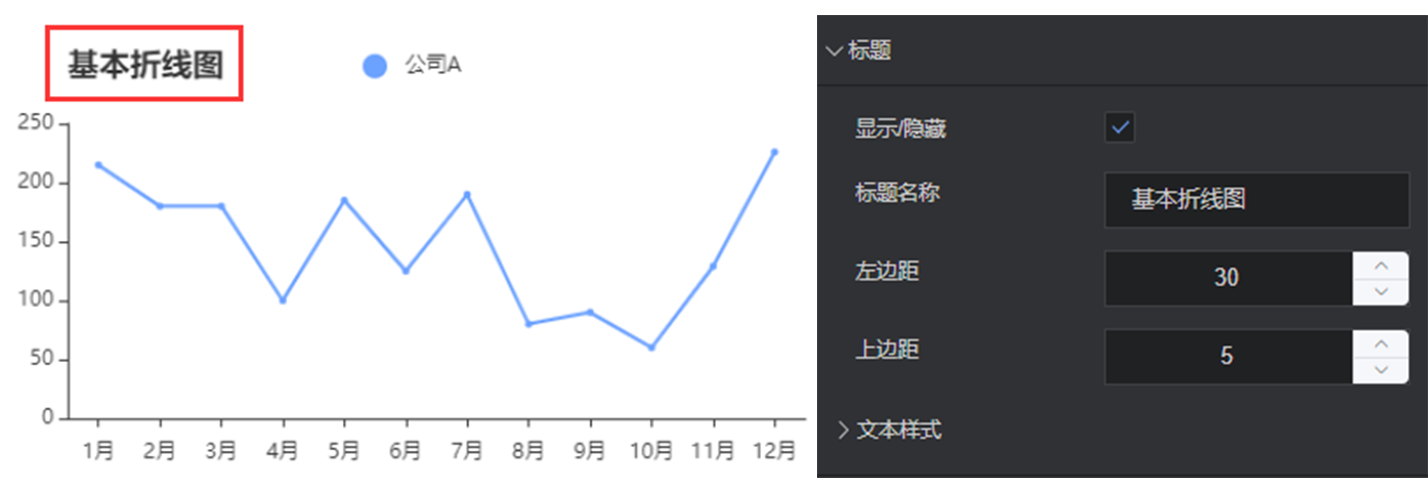
Title
Show/Hide: show/hide the chart title
Title name: name of the chart title
Left margin: distance between the title and the left side of container
Top margin: distance between the title and the upper side of container
Text style
Font size: font size of the title
Color: the color of the title, supporting color values in hex, rgb and rgba formats
Font: font of the title
Font weight: font weight of the title
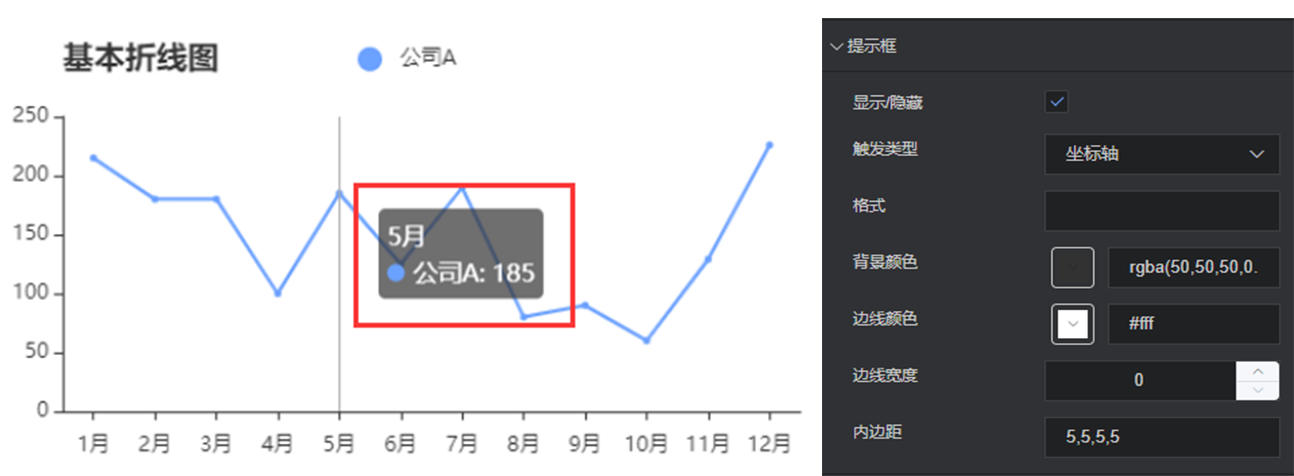
Prompt box
Show/Hide: show/hide the prompt when the cursor hovers on a point of the chart
Trigger type: show how to trigger a prompt box
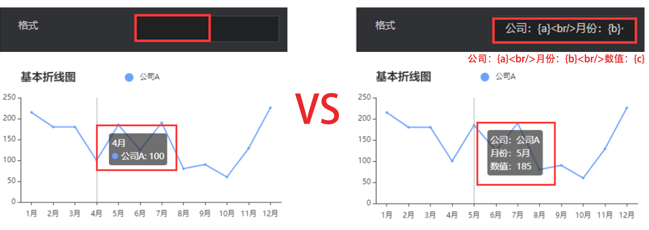
Format: The display content of the prompt box can be customized, where {a} represents the series name, {b} represents the value of the category axis, {c} represents the specific value.
Background color: background color of the prompt box, supporting color values in hex, rgb and rgba formats
Border color: border color of the prompt box, supporting color values in hex, rgb and rgba formats
Border width: border width of the prompt box, in px
Padding: padding of the prompt box. For example, “5,5,5,5” means that the top, right, bottom and left margins are 5px, 5px, 5px, 5px, respectively
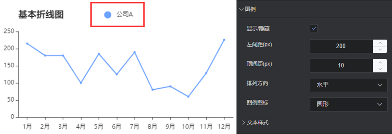
Legend
Show/Hide: show/hide the chart legend
Left margin: distance between the legend and left side of container
Top margin: distance between the legend and the upper side of container
Orientation: orientation of the legend, horizontal or vertical
Legend icon: icon of the legend, i.e. circle, square, triangle or diamond
Text style
Font size: font size of the legend
Color: color of the legend, supporting color values in hex, rgb and rgba formats
Font: font of the legend
Font weight: font weight of the legend
X axis
Show/Hide: show/hide the x axis of chart
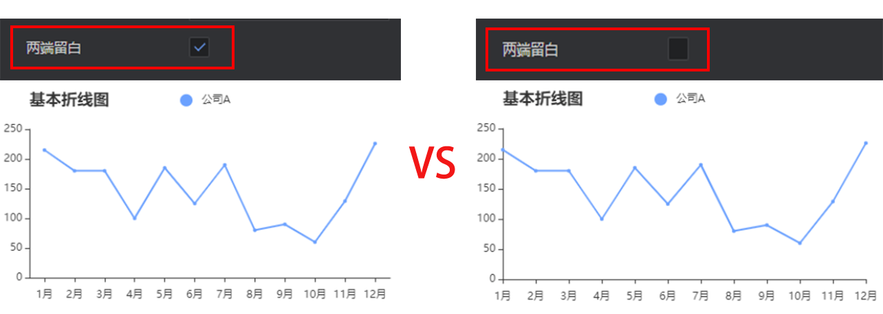
Margin at both ends: control whether the data starts from the zero scale. It is recommended to use margins at both ends, which is more attractive.
Axis name
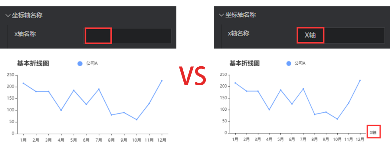
x axis name: the name of x axis
x axis name position: position of the x axis name. Options: start point, center, and end point.
Axis margin: distance between the x axis name and axis
Style
Color: color of the coordinate axis name, supporting color values in hex, rgb and rgba formats
Font size: font size of the axis name
Font weight: font weight of the axis name
Font: font of the axis name
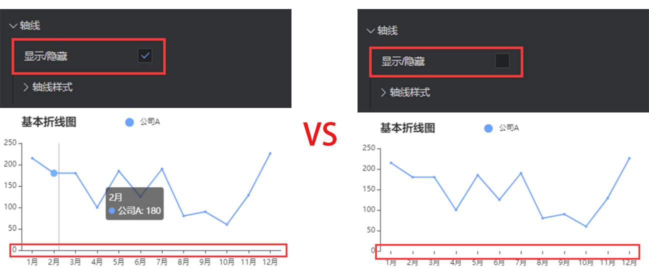
Axis
Show/Hide: show/hide the x axis
Axis style
Color: color of the axis, supporting color values in hex, rgb and rgba formats
Style: solid line or dotted axis
Width: control the axis thickness, in px
Scale value
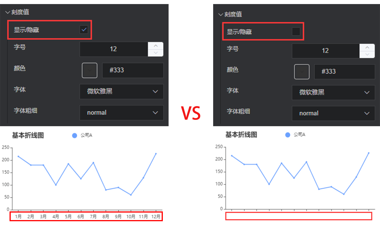
Show/Hide: show/hide the scale value of x axis
Font size: font size of the scale value
Color: color of the scale value, supporting color values in hex, rgb and rgba formats
Font: font of the scale value
Font weight: font weight of the scale value
Scale mark
Show/Hide: show/hide the scale mark of x axis
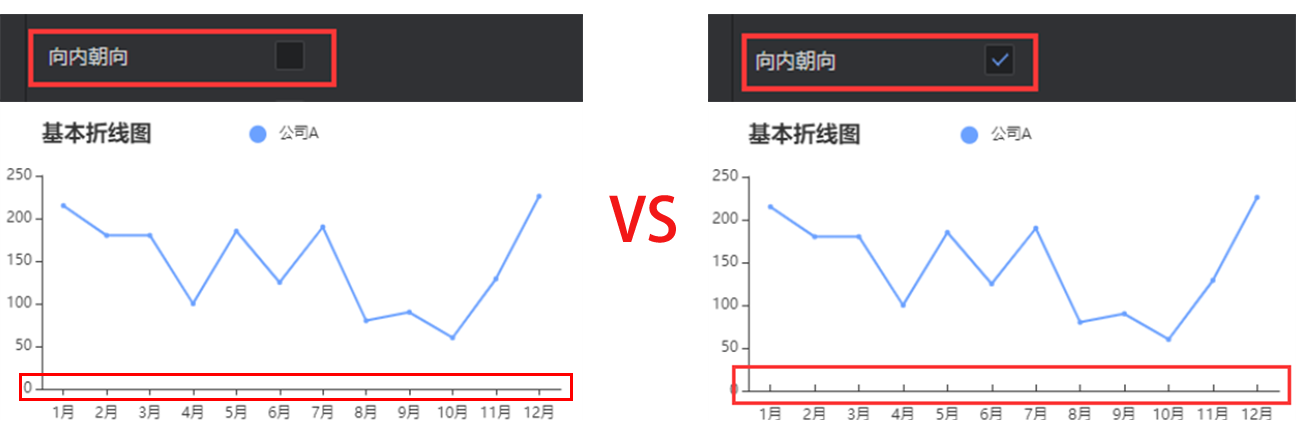
Inward orientation: control the orientation of scale mark
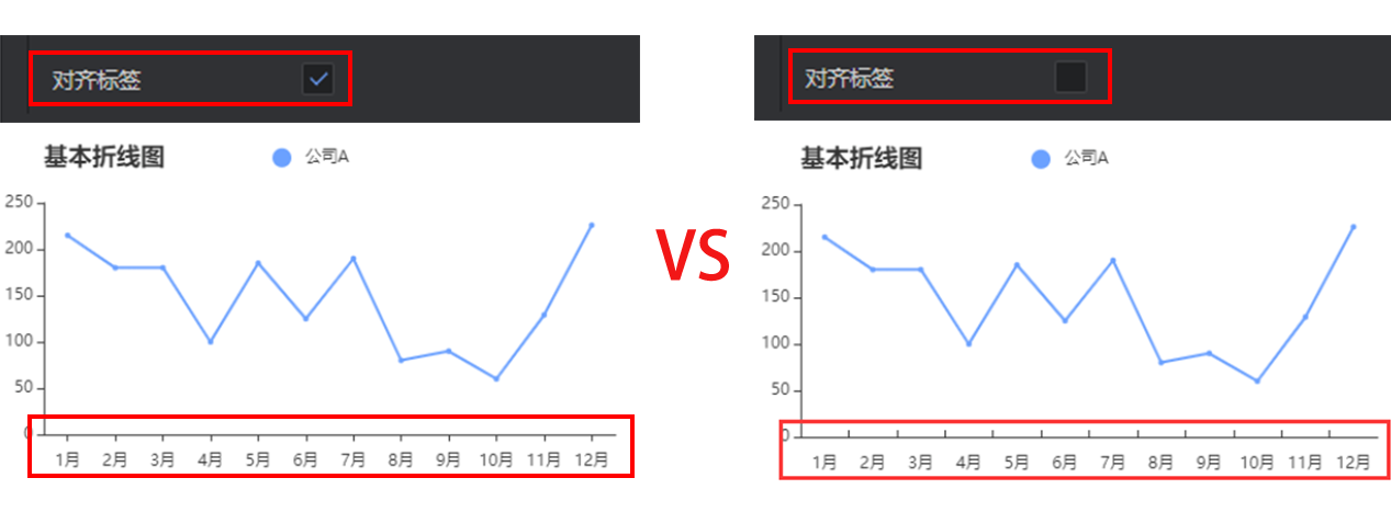
- Tag alignment: align the axis scale and tag
Scale mark style
Color: color of the scale mark, supporting color values in hex, rgb and rgba formats
Line width: line width of the scale mark, in px
Grid line
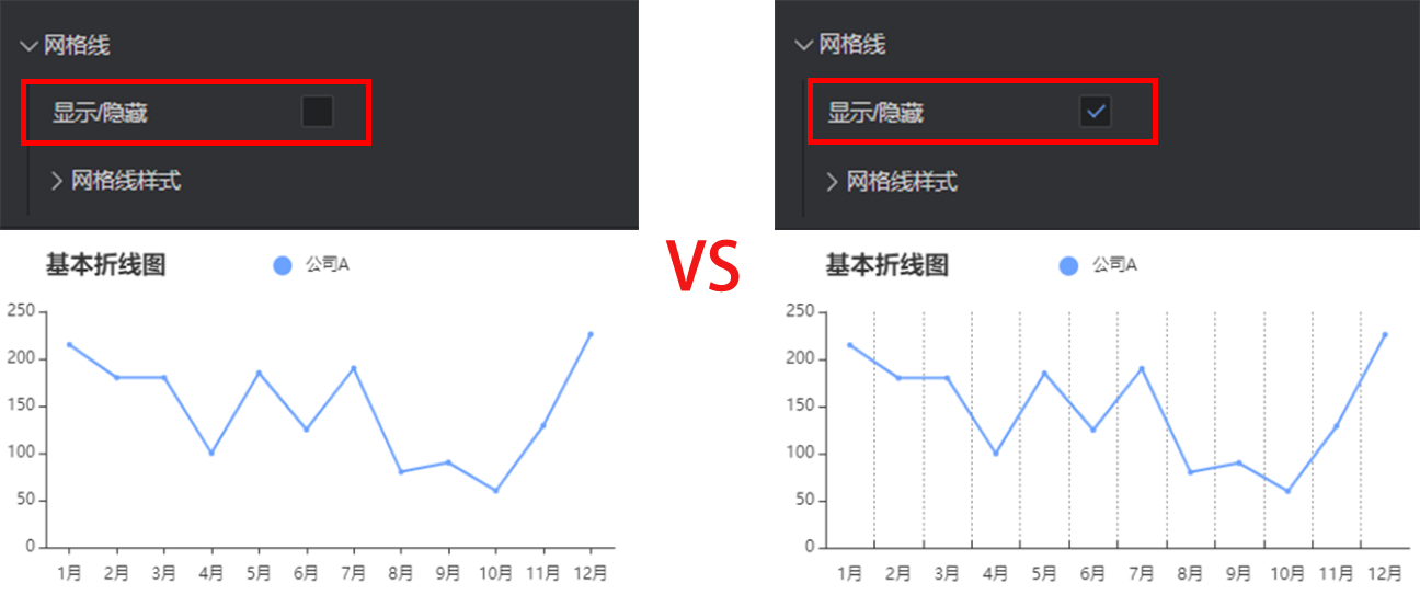
Show/Hide: show/hide grid lines in the chart area
Grid line style
Color: color of the grid line, supporting color values in hex, rgb and rgba formats
Style: style of the grid line. Options: solid lines, dotted lines, and dots.
Line width: width of the grid line, in px
Y axis
The configuration of y axis is essentially the same as that of x axis. Refer to x axis configuration.
Show/Hide: show/hide the y axis of chart
Axis name
y axis name: the name of y axis
y axis name position: position of the y axis name. Options: start point, center, and end point.
Axis margin: distance between the y axis name and axis
Style
Color: color of the coordinate axis name, supporting color values in hex, rgb and rgba formats
Font size: font size of the axis name
Font weight: font weight of the axis name
Font: font of the axis name
Axis
Show/Hide: show/hide the y axis
Axis style
Color: color of the axis, supporting color values in hex, rgb and rgba formats
Style: solid line or dotted axis
Width: control the axis thickness, in px
Scale value
Show/Hide: show/hide the scale value of y axis
Font size: font size of the scale value
Color: color of the scale value, supporting color values in hex, rgb and rgba formats
Font: font of the scale value
Font weight: font weight of the scale value
Scale mark
Show/Hide: show/hide the scale mark of x axis
Inward orientation: control the orientation of scale mark
Grid line
Show/Hide: show/hide grid lines in the chart area (divided by the x-axis scale)
Grid line style
Color: color of the grid line, supporting color values in hex, rgb and rgba formats
Style: style of the grid line. Options: solid lines, dotted lines, and dots.
Line width: width of the grid line, in px
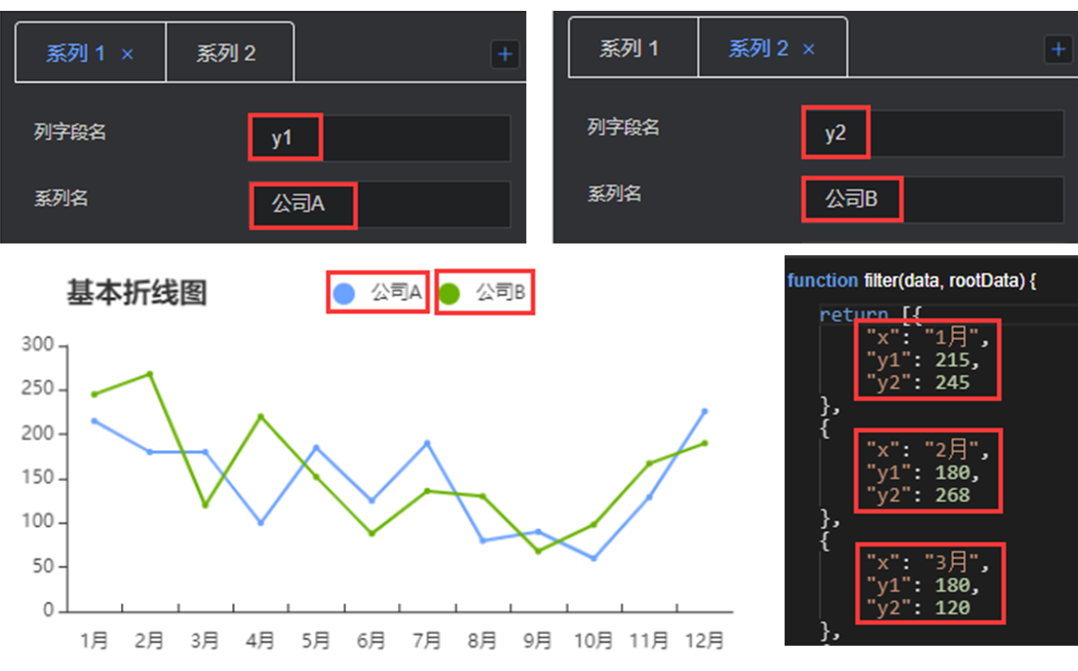
Data series
This configuration item is an array, for which multiple series can be configured. The editor will traverse data, so that the data can be rendered by one or more series configuration cycles. If some data needs to be customized to a specific style, you need to manually sort the data.
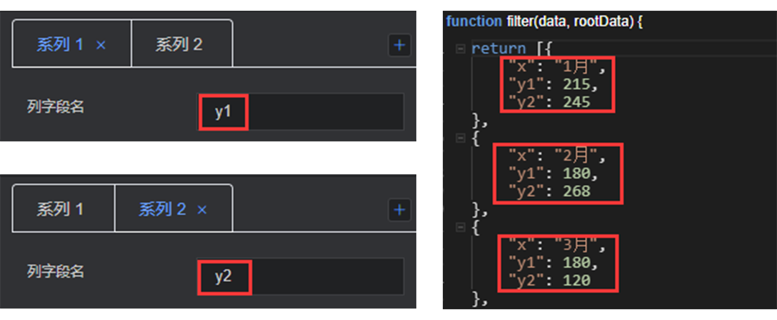
Column field name: consistent with the field in data configuration, controlling the display of one group of data in the chart
Series name: customize the legend name by changing the series name
Inflection point style: style of the data point. Options: null, dot, and circle.
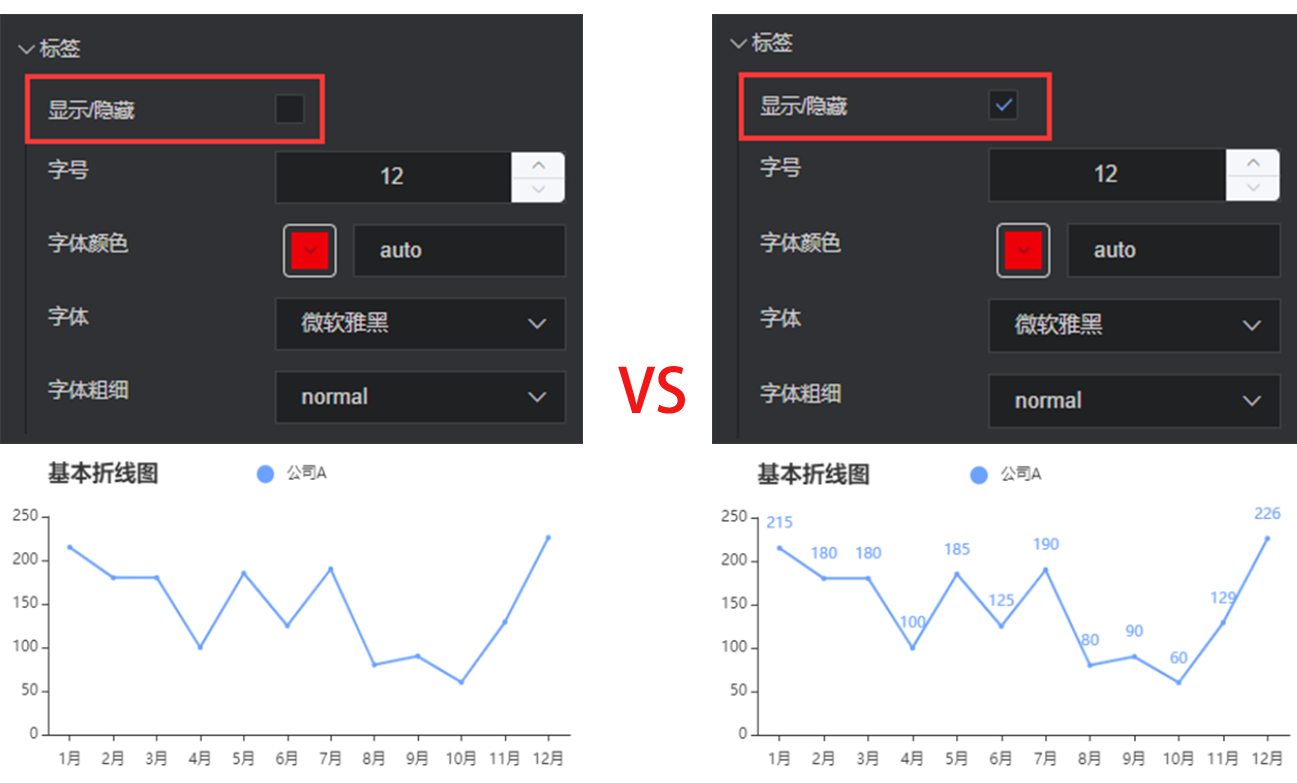
Tag
Show/Hide: show/hide the chart tag in this series
Font size: font size of the tag
Color: color of the tag, supporting color values in hex, rgb and rgba formats
Font: font of the tag
Font weight: font weight of the tag
Polygonal line style
Color: color of the polygonal line, supporting color values in hex, rgb and rgba formats
Line width: width of the grid line, in px
Style: style of the polygonal line. Options: solid line, dotted line, and dot.
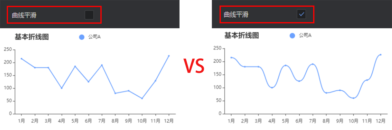
Curve smoothing: After this option is enabled, the polygonal line will be displayed as a continuous curve.
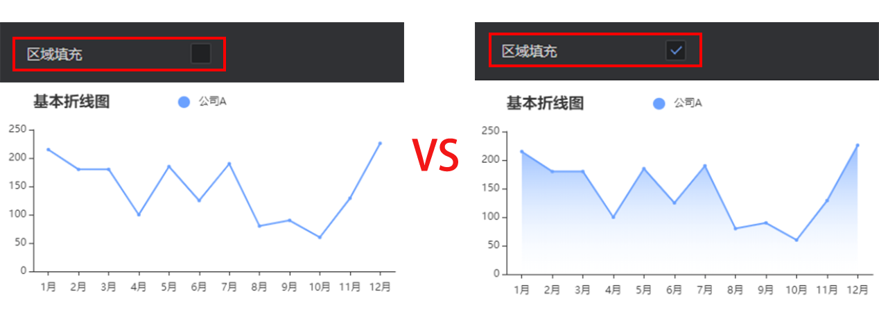
- Area fill: After this option is enabled, the polygonal line area will be displayed in a gradient manner.
Data
return [{
    "x": "January",
    "y1": 215,
    "y2": 245
}, ......]
x: category axis field
y: custom field of the data axis, consistent with the column field name in each sequence configuration