Carousel list
The carousel list is a type of text component, supporting the custom configuration of line/column styles and contents. Carousel animation can be applied to clearly display data in the list form on the large screen. This document introduces the meaning of each configuration item of the carousel list, to help you use the carousel list component quickly and accurately.
Configuration
Basic settings
width: component width in the editor
height: component height in the editor
top: distance between the component and the top of editor
left: distance between the component and the left side of editor
Global
Lines in table: show/hide the prompt when the cursor hovers on a point of the chart
Carousel
Enable/Disable: enable/disable the carousel format of list
Animation mode: set the carousel mode. Options: scrolling on the full screen and scrolling one by one.
Time interval: time interval of carousels, in seconds
Header configuration
Show/Hide: control the display of list header
Top margin: control the top margin of header
Bottom margin: control the bottom margin of header
Background color: background color of the header, supporting color values in hex, rgb and rgba formats
Text style
Alignment: alignment of the text. Options: left alignment, center alignment, and right alignment.
Color: color of the text, supporting color values in hex, rgb and rgba formats
Font size: font size of the text
Font: font style of the text
Font weight: font weight of the text
Line configuration
Odd-numbered line background color: background color of odd-numbered lines, supporting color values in hex, rgb and rgba formats
Even-numbered line background color: background color of even-numbered lines, supporting color values in hex, rgb and rgba formats
Top margin: control the top margin of each line
Bottom margin: control the bottom margin of each line
Text style
Alignment: alignment of the text. Options: left alignment, center alignment, and right alignment.
Color: color of the text, supporting color values in hex, rgb and rgba formats
Font size: font size of the text
Font: font style of the text
Font weight: font weight of the text
Serial number column
Show/Hide: control the display of serial number column
Alignment: alignment of the serial number. Options: left alignment, center alignment, and right alignment
Inner margin
Top margin: control the top margin of each line
Bottom margin: control the bottom margin of each line
Left margin: control the left margin of each line
Right margin: control the right margin of each line
Serial number value
Width: width of the serial number value
Height: height of the serial number value
Background color: background color of the serial number value, supporting color values in hex, rgb and rgba formats
Fillet radius: control the circular status of the corners of serial number value. The greater the value, the closer the corners are to a circle.
Text style
Color: color of the text, supporting color values in hex, rgb and rgba formats
Font size: font size of the text
Font: font style of the text
Font weight: font weight of the text
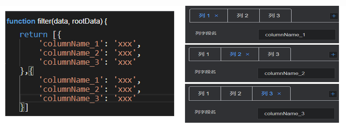
Custom column
This configuration item is an array, for which multiple series can be configured. The editor will traverse data, so that the data can be rendered by one or more series configuration cycles. If some data needs to be customized to a specific style, you need to manually sort the data.
Column field name: field name of the column, consistent with the field name of data item
Column name display: column name displayed in the header
Width: width of the column
Left margin: left margin of the column
Right margin: right margin of the column
Data
return [{
    'columnName_1': 'xxx',
    'columnName_2': 'xxx',
    'columnName_3': 'xxx'
}]
- columnName: column name field, consistent with the column name field of custom column